


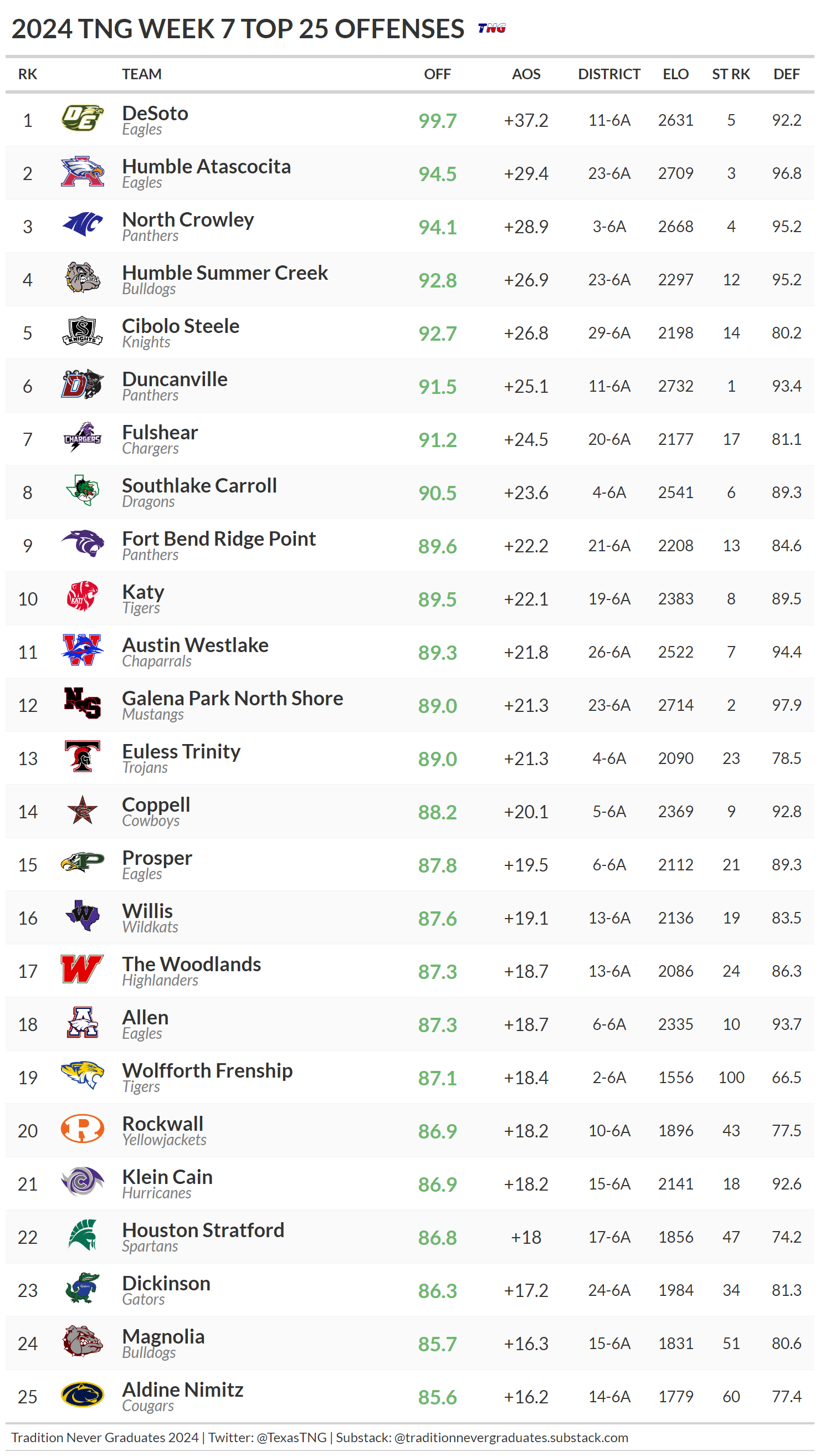
Top Offenses and Top Defenses Through Week 6
Check out the state leaders in Adjusted Offensive Scoring and Adjusted Defensive Scoring

We debuted our adjusted scoring leaders last week and, as you’ll see below, there were some changes this week. Since these are opponent-adjusted numbers, even teams that didn’t play last week may have had their numbers and their ratings change as a result of updated information relative to their opponents’ strengths.
If you’ve been following us for awhile, you’ll be familiar with our AOS and ADS numbers. For those unfamiliar, AOS is simply “adjusted offensive scoring” and ADS is “adjusted defensive scoring”. We calculate these metrics by considering each team’s opponents and we compare how they did against them relative to how an average team would be expected to perform against the same team.
For example, let’s say DeSoto plays an average team (Elo around 1430 and OVR around 75) and they put up 68 points. For that game, DeSoto would get an AOS score of +40 (a ridiculously high number, but hey it’s DeSoto), because a 75 OVR team would typically allow 28 ppg. Simple right? When teams play more difficult teams, they don’t have to score as much to achieve a high AOS, because highly rated teams would be expected to give up far less. This is our way of correcting for simple points per game stats to get something more relevant and powerful. Think of ADS being calculated the same way, just in the other direction. Both AOS and ADS are then re-scaled to our new Madden-style grading system (generally a 60-100 scale) to produce a grade listed in the OFF and DEF columns of each chart below.
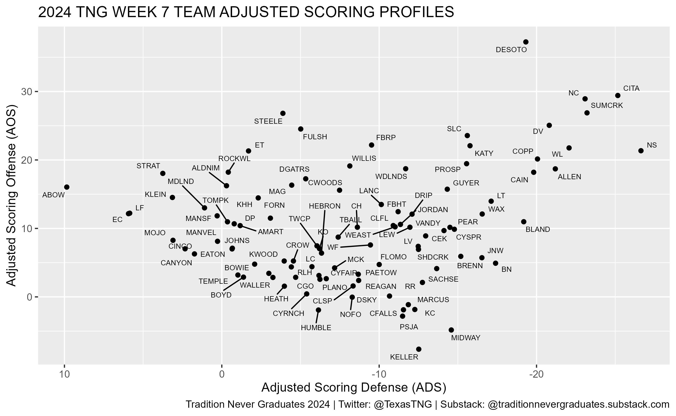
Below the Top 25 Offense and Defense charts, we’ve also included a scatterplot of AOS and ADS so you can see how the top teams compare sort of spatially.
Like everything else we put out, we don’t consider these charts to be perfect by any means. We just think they’re interesting. Some teams could be higher than they deserve, some may be lower, but we think we’re in the neighborhood of where teams currently stand based on their on-field performance to date.

This scatterplot doesn’t list all 249 teams in order make these more legible (yeah, it actually could be worse!). This graph represents the Top 101 teams by their combined scoring metrics…
As always, thanks Gents. Great data info and conversation material. Keep it Up!!!!