

Is Our Model Any Good?
Is Our Model Any Good?
Evaluating the accuracy and viability of the TNG ratings model

We’ve referenced our model throughout our initial posts in our 2022 Season Preview series as well as in our TNG Timeline features, and we gave a detailed breakdown of how we arrived at our model in our TNG Ratings Methodology post, but we’ve yet to show you how well it actually performs…until now. We’ve mentioned that our model predicted the correct winner in over 76% of all games played from 2008-2021, but here we’re going to take a deeper look to see how well that holds up in various situations.
Below, we’ll walk through several charts which give us some sense that we’ve prepared a decent model, but we’ll also address the model’s limitations as we go along.
At it’s most basic level, an Elo model produces a projected win percentage for either team in a matchup based on their respective Elo ratings heading into the game. For example, in a game between Team A and Team B, with Elo ratings of 2100 and 1925 respectively, our model would give Team A a 67.5% chance of winning and Team B a 32.5% chance of winning. If our model is any good, we should hope that teams given a 67.5% chance of winning actually win at a rate close to that. Across our 20,000+ game database, how did our model perform at each projected winning percentage from 0-100%? Let’s take a look…
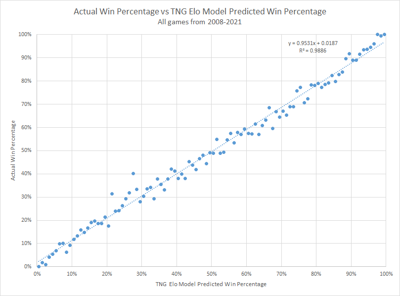
As it turns out, our model produces a virtually linear relationship between actual win percentage and model-projected win percentage, with an R-squared of 0.9886, which is fantastic. That means that our model, on average, is pretty spot on in assigning a projected win percentage. Each of the blue dots in the chart above represents all of the games falling within a 1% range of projected win percentage on the x-axis (there are about 180-220 games represented by each dot) and what that group’s actual win percentage was on the y-axis. The one outlier that leaps off the page is an interestingly odd case at about 27% projected win percentage - those teams won 40% of the time! Given how tightly correlated nearly all of the rest of the groupings are, that’s remarkable and baffling.
Another way to evaluate our model is to look at something called the Brier Score. Brier Score is basically the means squared error of a probabilistic forecast. If we just gave every team a 50% chance of winning every game, that ridiculous model would have a Brier score of 0.25, so we should hope that our model beats that handily. For comparison, fivethirtyeight.com’s NFL Elo model registered a Brier Score of 0.219 for the 2019 season. How did ours do over time?

Our model seems to do well in terms of Brier score too. One potential drawback to using Brier scores for high school football games is that we could get an artificially lower number due to the fact that we have many games where one team is favored 90%+ over their opponent; those games would generate a near-zero Brier score, bringing down the overall number. However, looking at how our model performed in the 2021 playoffs from the second round forward, we can see that it correctly picked 79% of the winners and it registered a Brier score of 0.126, so we can feel good that our numbers above aren’t overly reliant on games that are easy to pick.
Another fun aspect of an Elo system is that we can produce projected point spreads for every game. While projected win percentage is accessible enough, everyone is familiar with point spreads. However, what you’ll see on this site are just raw projected spreads based solely on the Elo rating differences between the teams and are presented simply as another way to conceptualize the model-perceived advantage one team holds over another. Below, we’ll look at the average performance of the projected spreads first and then we’ll look at how well the spreads perform on an individual game basis.
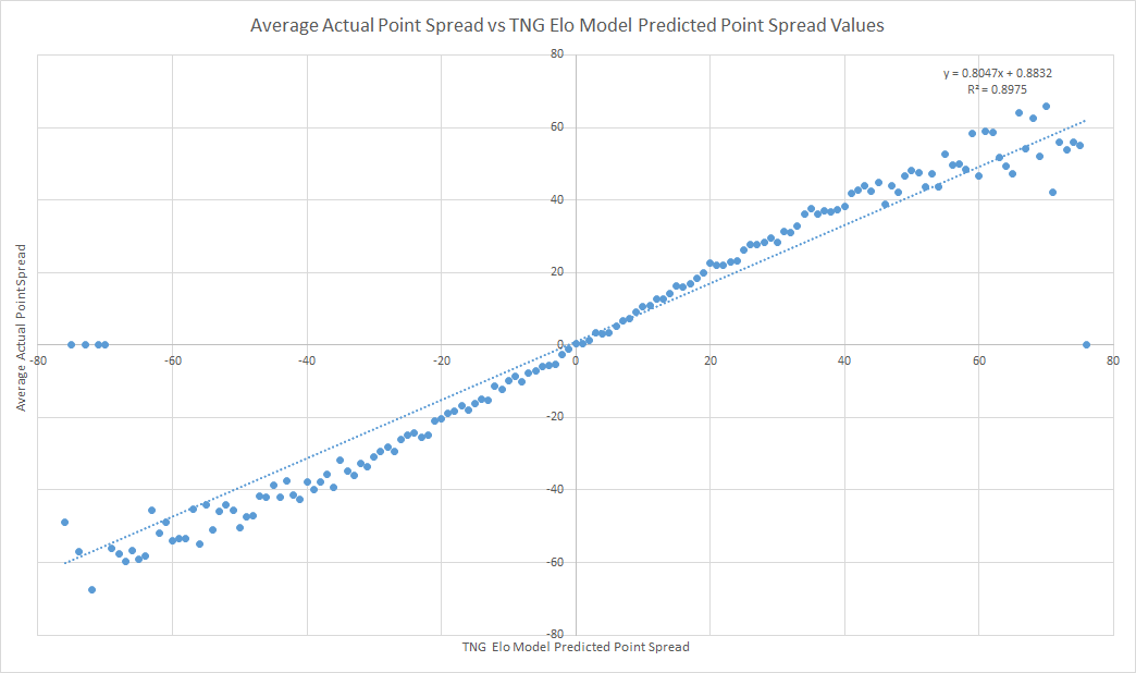
As we saw with the projected win percentages, the actual point spreads vs projected point spreads again produces a nearly linear, ideal relationship as shown in the chart above. On average, 23 point favorites won by about 23 points; 7 point favorites won by 7 points, and so on. The data flares out at the extreme ends of the chart, but between 40 point underdogs and 40 point favorites, everything in-between is basically a 1:1 relationship. Incredible, right? To a degree, yes. But, when we look at a projected spread between two teams, we really only care about that game. It’s certainly good that we can average all of the games for a projected spread and come up with actual numbers that match, but what about game to game variability? Does the above graph mean that every game with a predicted 14 point spread will end with a 14 point margin? You do remember that we’re dealing with groups of 50-100 14-18 year old boys, right? Let’s bring this ship back down to Earth…
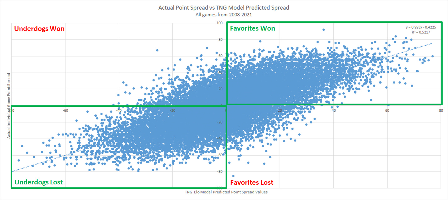
The chart above does a great job of illustrating the randomness that makes every game interesting despite what the consensus may be heading into them, but it also, even in its chaotic glory, further confirms the validity of the model.
Our primary goal is to project winners, and while the projected point spreads may not be terribly accurate on a game-to-game basis (Vegas isn’t either…and we ain’t Vegas), they do still provide a good proxy for assessing which team is better. The green boxes on the chart above house all of the games that the model picked correctly (~76%), while everything outside of the green areas are all of the games that the model missed on (~24%). While for each predicted spread along the x-axis you can see the wide variety of actual point spreads (looking up and down on the y-axis), you can also see that there is a fairly tight concentration of points along the trend line which is confirmed by the decent but unspectacular R-squared of 0.52.
Given all of the above, we feel like we have a pretty solid model from which to provide analysis and unique content. We’re excited to put our model to the test with the 2022 season, but we are fully aware of its limitations and we have a healthy respect for the fact that anything can happen when two teams line up against each other…it’s literally why they play the games and why we are brought out of our seats by what we see. As we stated in our About page…
What we present on this site amounts to nothing more than talking points and banter. Regardless of what our model projects, the games are won by the tireless work of the incredible coaching staffs across the state and the blood, sweat, and tears of the phenomenal student athletes who give their all each week to represent their communities, supported by their families, friends, bands & color guards, drill teams, cheerleaders, administrators, and volunteers. There is nothing quite like Texas high school football and we’re happy to do our part to promote and support it.
We hope to add to your enjoyment of the upcoming seasons while providing some entertainment and insight that you don’t find elsewhere. If you like what we bring to the table, please share our site with your friends and family by forwarding links, hitting the Share button below, or by forwarding our emails if you’re a subscriber. If you’re not a subscriber, just enter your email below and get our future posts delivered directly to your inbox for free.